


Hue and cry
close

Mathilde Binetruy
Freelance journalist
CLOSE


As an antidote to doom and gloom, watchmakers are dipping into the Pantone guide. Electric blue, lime green or canary yellow, 2016 timepieces bring on the colour. Fans of Instagram filters should look away now.
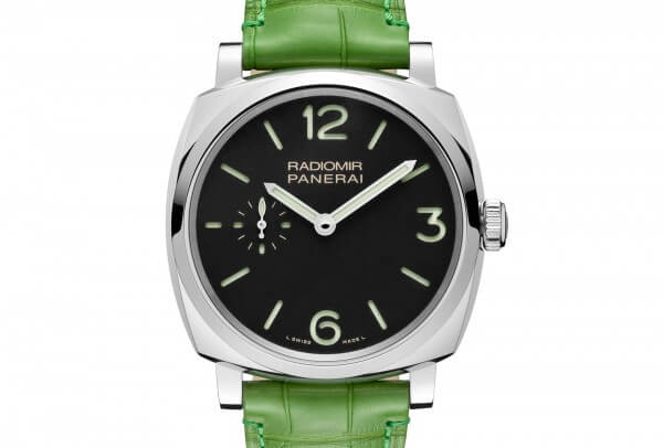
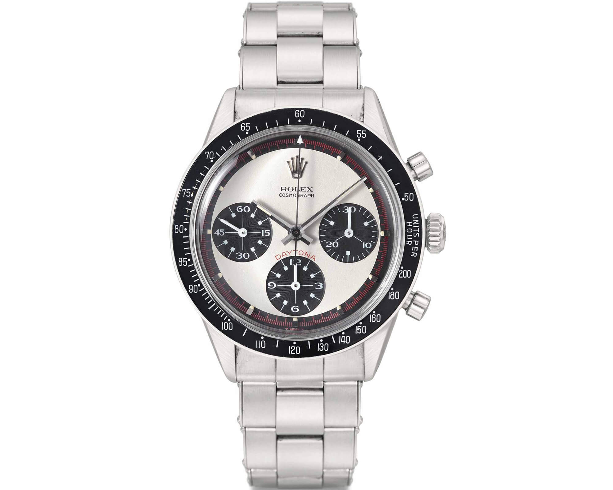
Everyone knows Officine Panerai. The one with the big movements, generous proportions, an oversized crown guard, sandwich dials and Super-LumiNova, handy when searching for your keys in the dark. And, since last autumn, an apple green strap.
The Florentine brand didn’t just show a Radiomir 1940 Ref 540 at Watches&Wonders in Hong Kong (September 30th-October 3rd 2015): it showed it on a bright green leather band. Who would have thought Panerai would be the one to usher in watchmaking’s latest rainbow trend? Until now, a certain monotony, drabness even, prevailed over our wrists, but since SIHH a new factor has turned the tide: colour.
Einstein's brain inside a lollipop
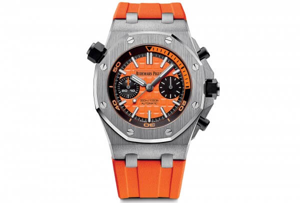
Colourful wrist candy is up there with florals and stripes as the fashionable what-to-wears. And we don’t mean shrinking violet. Dials, straps, bezels… watchmakers are painting the town not just red. At Audemars Piguet, big, bold colours make the perfect foil to the sharp, masculine contours of the Royal Oak Offshore Diver Chronograph. Mouthwatering dials – mandarin, lime, lemon and blue – the iconic octagons are brought to life by an automatic 3124/3841 movement, mixing fun with high-grade mechanics. Line them up, and they could easily be a tribute to the high priest of Pop Art, Andy Warhol. A sure sign of success, journalists at the press preview greeted these new designs not with the usual hums and haws but with “yeaaaah…. not bad at all.”
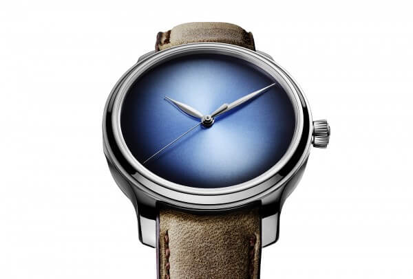
Moser & Cie elicited similar reactions with its Endeavour Centre Seconds Concept Funky Blue. Stripped bare of any kind of numeral, marker, logo or other inscription, it would make any other creation appear bland. Which doesn’t prevent it from exuding a quiet confidence and natural class, thanks to a sky-blue fumé dial with sunburst decoration. It can take years to get a “Wow” out of a fashion editor. The five minutes it took here has to be a sign.
Sophisticated shades
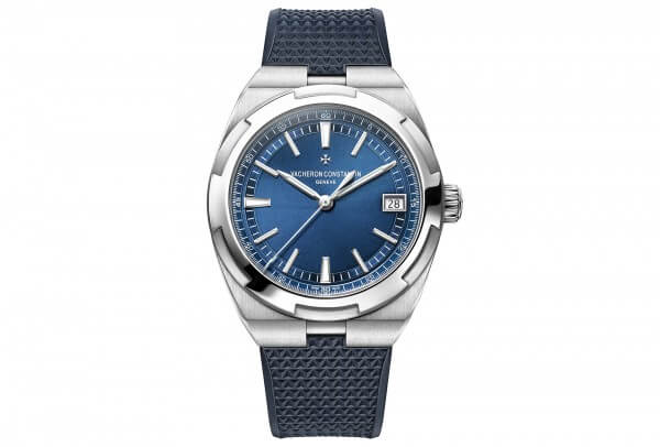
The idea of adding a touch of bold colour appeals to other brands too, sometimes playing on more or less nuanced shades. Vacheron Constantin is putting its Overseas sport watch back on the map with a slew of new references whose common denominator is a deep blue dial. Already last year, the Manufacture released two limited editions with ultramarine dials that didn’t go unnoticed. Picking up where it left off, this year’s dials are even denser. While colour isn’t the only new feature of what is a major and highly successful redesign, it does tend to stick in the mind. More, please!
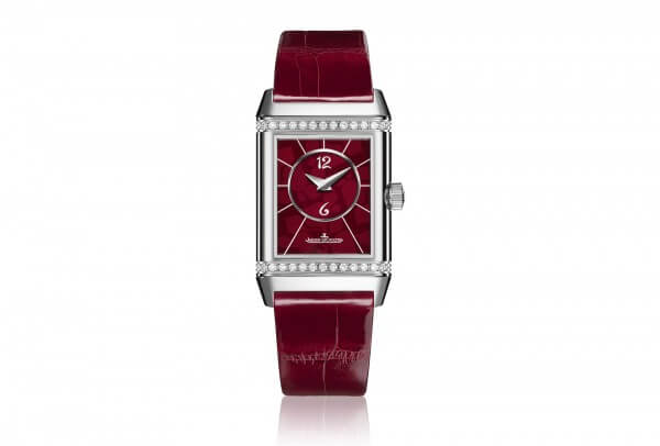
How to become another while remaining unchanged… this was also the test for the Reverso as it toasts its 85th anniversary, and Christian Louboutin was the man chosen to take up the challenge. Having branched out from his famous red soles into an entire colour empire, the designer is now accessorising a pop-up collection for Jaeger-LeCoultre. This includes a Reverso Classic Duetto, ablaze with vermilion from the dial to both sides of the strap. Colour is the game-changer here, but in a shade more subtle than scarlet.
Primary school
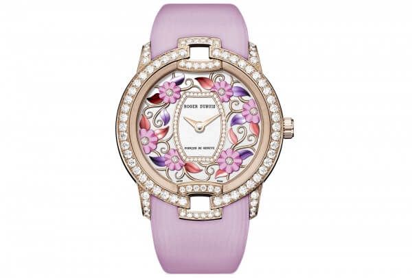
When picking out the latest ‘it’ colour, and with such an avalanche of shades to choose from, some turn to the Pantone® colour bible. The company, which is well-known for its universal colour charts, has the responsibility of electing ‘Color of the Year’. Or, for anyone aiming to be on-trend in 2016, two colours of the year, namely Rose Quartz 13-1520 and Serenity 15-3919. Softer, soothing pastels that conjure up Roger Dubuis’ Blossom Velvet Pink and Blossom Velvet Blue. Lionel Favre, who is head of product design at Roger Dubuis, notes how “we wanted to create a play of light on the dial that would vary with the different depths of enamel and the movement of the wrist.” This meant finding pigments that would produce the exact nuance of each flower and leaf on these two creations, each presented on a coordinating strap.
Hautlence, meanwhile, plumped for primary shades with its Vortex Primary. Part stained glass window, part Mondrian, this 18-piece limited edition highlights a structure in blue, red and yellow tinted glass. Something Eric Cantona, Hautlence brand ambassador who co-designed the watch, justifies as allowing each individual “to give time the colour they want.” There is a psychology of colours: blue calms, red energises and yellow stimulates the mind. Bear it in mind next time you go shopping for a watch!